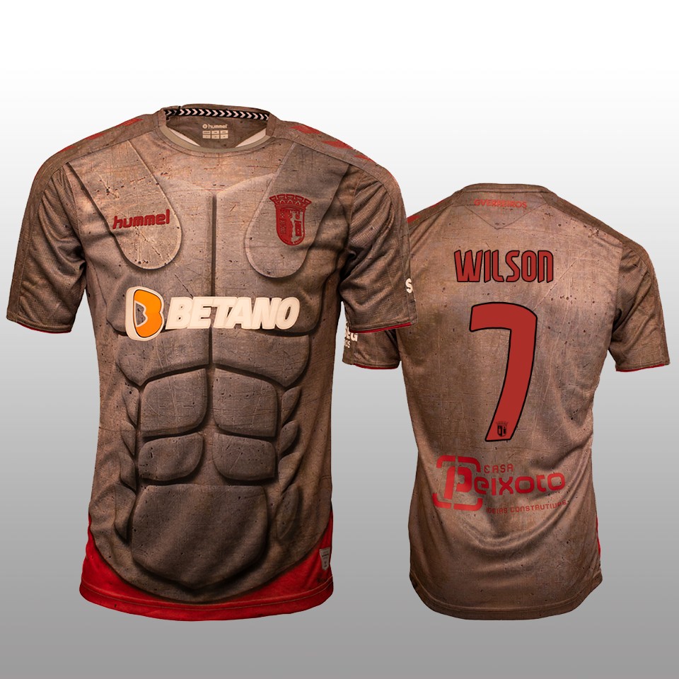
Soccer teams may have some weird kits, but the 2019-2020 SC Braga third kit is by far one of the worst I have ever seen.

The Primeira Liga team claims the armor of Roman soldiers gave the inspiration for this jersey, but to me, it looks as if someone took a jersey, stuck blocks of styrofoam, and painted the whole thing dark grey. The red is too dark, and the logo is barely distinguishable. The font is no good either. It lacks consistency. Some letters are straighter, while others are more curved. Add on an orange and white sponsor logo, and you have one of the ugliest jerseys in soccer.

